
Internet users are accessing the web from multiple types of devices nowadays. This includes desktops, mobiles and tablets, all of which have different screen sizes. To ensure your website visitors have the best possible experience, your website needs to look good on all screens no matter the shape or size. A responsive website design is the best solution for you to make sure all your potential guests can easily make a booking regardless of the size of their screen and this helps bookings and supplements our leading hotel booking engine online.
What is a responsive site?
A responsive website will automatically adjust and scale its content to any screen size. This means if you have large photos or blocks of text, they won’t be larger than the device’s screen width. If a visitor is using a mobile phone or other small device, they shouldn’t have to rotate their screen, pinch in to zoom or scroll horizontally. Creating unnecessary work for your users can cause frustration if they have to figure out how to do something.
For example, a website viewed on desktop may have a horizontal menu across the screen while on mobile it is vertical and hidden behind a menu link. The links will also be bigger on mobile so you can “click” by tapping with your finger.
A responsive site is also a vital tool to help with Search Engine Optimisation (SEO) as Google gives preference to mobile friendly websites. Google even has a Mobile Friendly Test you can run to check how mobile accessible your website is.
Importance for hotels and accommodation providers
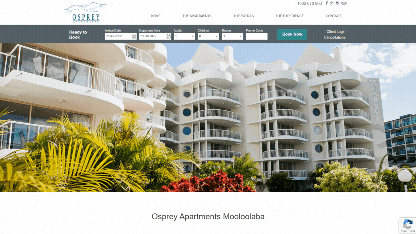
As an accommodation provider, your most important feature is that the guest can easily make a booking. They should be able to find a booking panel or link on the Home Page after landing on the website instead of clicking through multiple pages trying to find how to book.
You are also competing with well-established apps such as Booking.com and AirBnB so your guest should not want to give up and book on a site they’re more familiar with. This is particularly valuable for the guest that is already traveling and is only using their mobile device.
It is also important that your contact details are easy to find on a mobile website. A click-to-call phone number or button in a prominent spot means your guest can call if they need more information. Integrating Maps also allows the guest to easily get directions to your property.
Levart’s responsive websites
Getting your own responsive website doesn’t have to be hard or overwhelming! All of Levart’s stunning website designs are already completely responsive and made specifically for Accommodation Providers. We’ve taken all the hard work out, all you need to do is add your own content and rest assured it will look great on all devices!